You will have heard us talk about how our funding has been cut but the graphic below illustrates what this looks like. The coins in red show the gap after inflation.

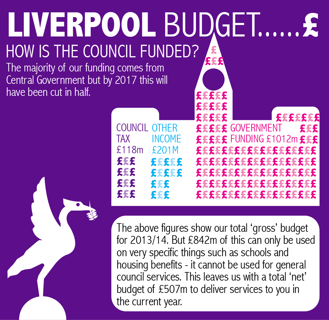
We showed you that only 9% of our income comes from Council Tax. Below is the same graphic with actual figures showing the amount of money on it.
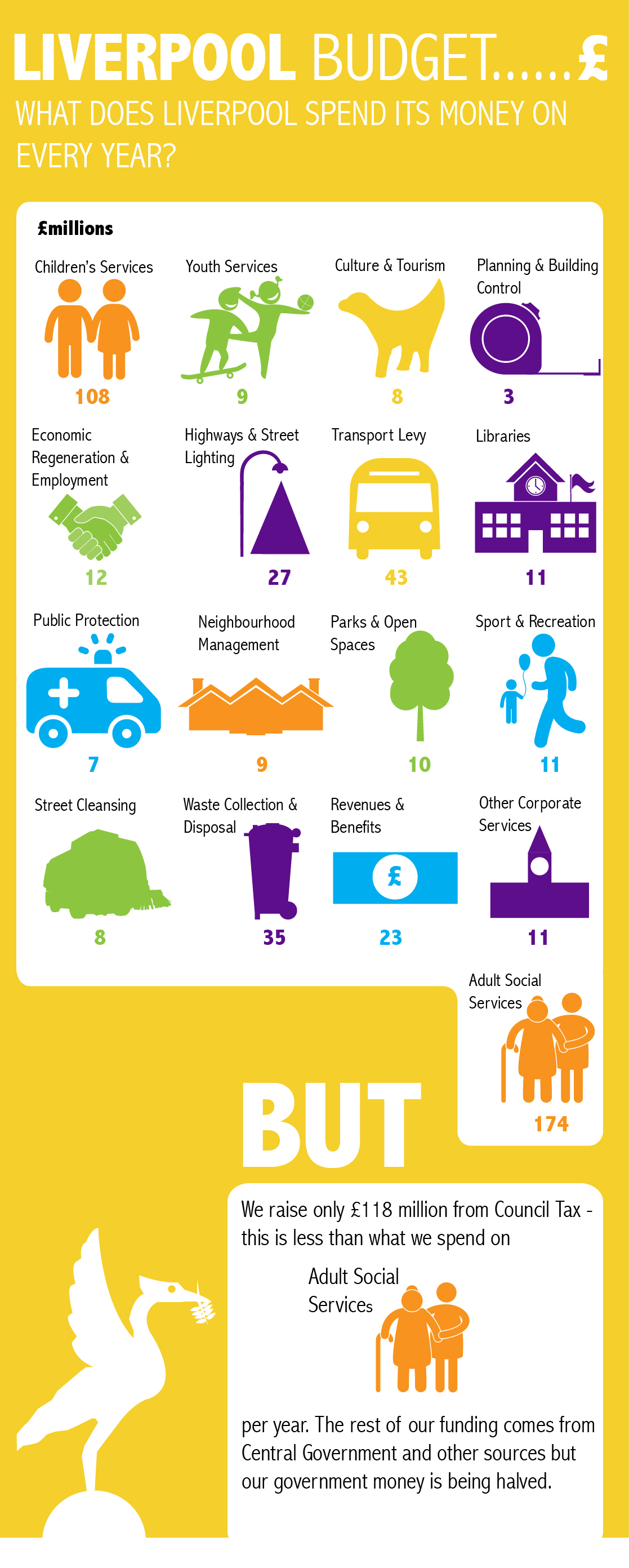
You will have seen above that we receive £118m in Council Tax every year. Below is a graphic showing what we spend on our services.
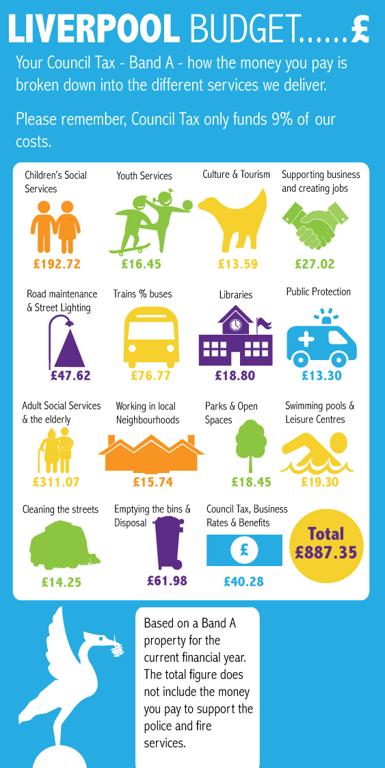
 So if you are in Council Tax Band A, how does the funding you give us break down across the services we deliver?
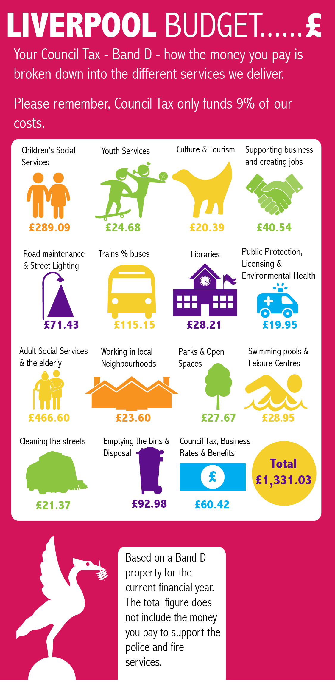
And if you are in Band D?
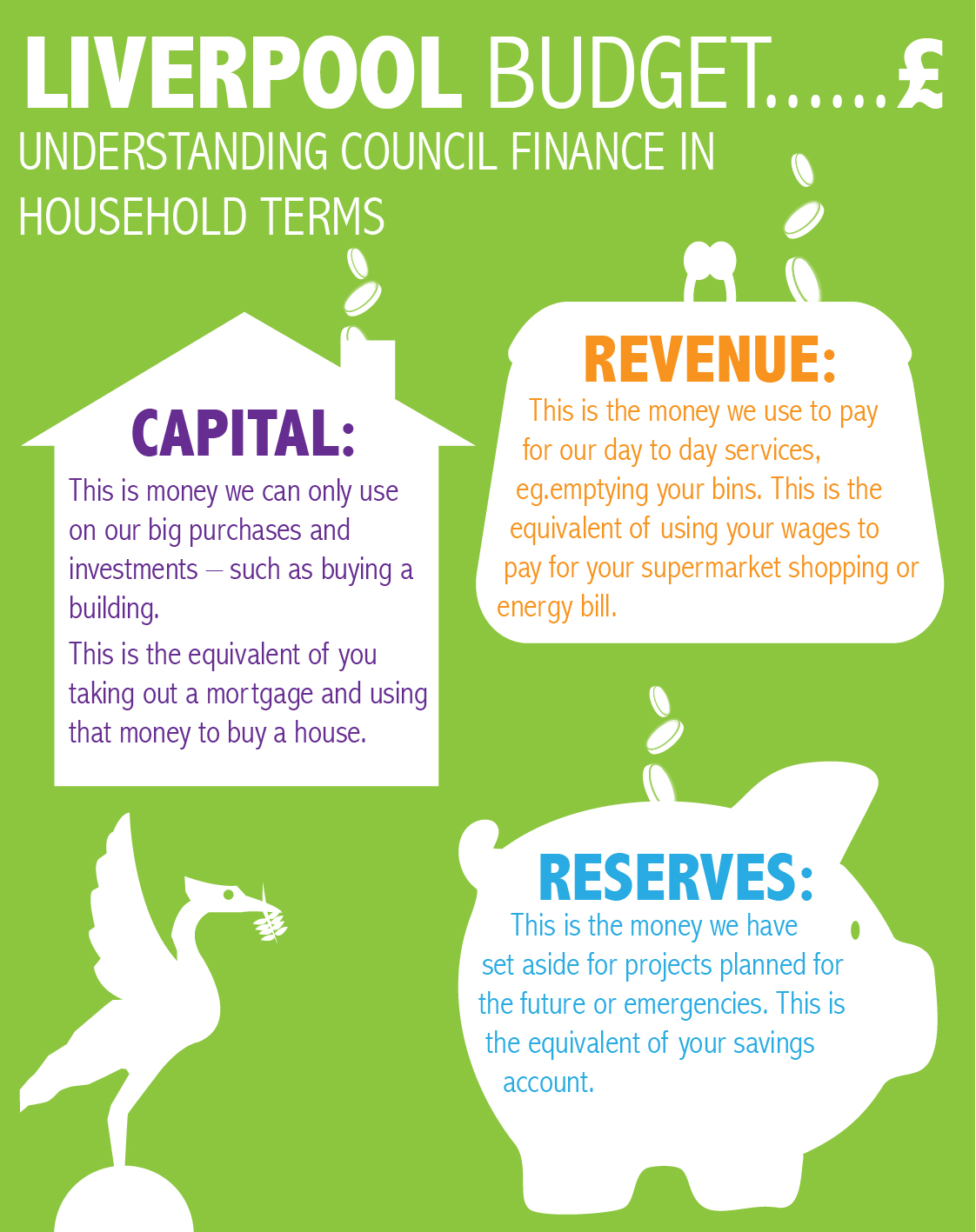
You may have heard us using jargon like capital and revenue. Ever wondered what that means?