You may have seen a lot of infographics on the City Council’s Twitter feed lately.
This is part of a campaign to raise awareness of the funding challenges Liverpool faces and help residents understand where councils receive their money from.
Below, we will explain some of the infographics in a little more detail.
This first infographic shows where the money you pay in Council Tax goes. Not all of it is to provide council services.
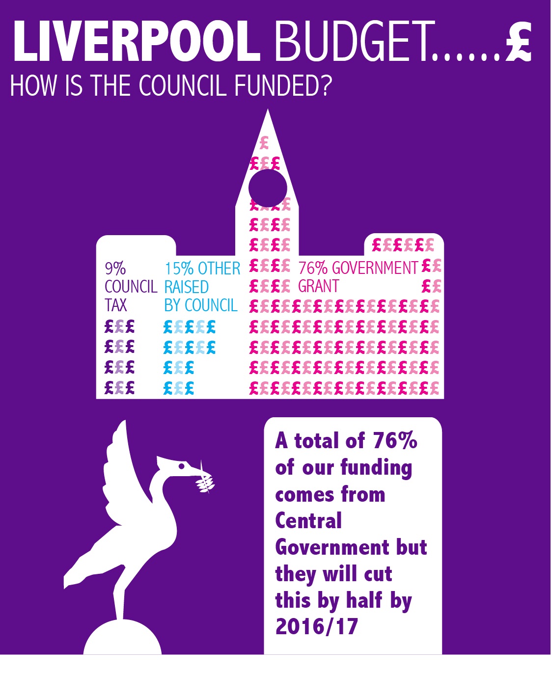
Do you know where Liverpool City Council receives its money from? You may be surprised to learn that Council Tax makes up only 9% and the vast majority of our funding comes from Central Government.
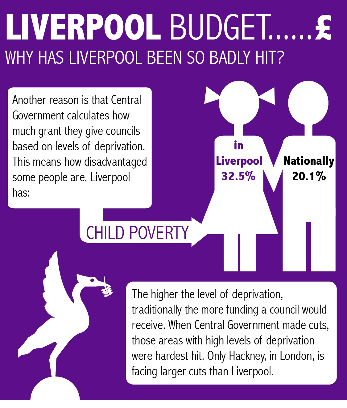
You will have heard that the amount of money we receive from the Government has been cut by half but you may wonder why this has happened. The image below explains that the cuts have tended to hit councils with the highest levels of deprivation – poor communities – the hardest.
You may be wondering why the city does not get more money through Council Tax to pay for services. The infographic below explains why this is the case for Liverpool.
And now you understand that we have lots of properties in Council Tax bands A and B, you may be curious to know how many homes we have in each band. The infographic below explains this.
So if most of our homes are in Band A, how many homes in this band would we need in the city to pay for all Council Services?
And if you are curious to know how many Band D homes we would need in the city if they were to fully fund the council the following infographic telles you.


